|
IMAGE EDITING Chuck Williams |
WHY DO THE COLORS LOOK SO WEIRD?It turns out that light comes in different "flavors."It's called "color temperature." Daylight is blue. Most artificial lights are yellow. In fact, they’re even more blue, and even more yellow than you normally ever notice. When you're standing in an indoor space with windows, your brain tends to "auto correct" for the different colors of the lighting, and it actually does an amazingly good job of it. The indoor lighting may look a little warm to the eye – the outdoor a little cool, but when you take a photograph, the result can be completely unexpected. And surprisingly garish. The interior can come out an almost bug-light shade of orange while the daylight from the windows goes electric neon aquarium blue. Well, that's what I call it. :-) Your digital camera has a setting called "White Balance." You can set it to correctly render the daylight
YELLOW AND BLUE ARE OPPOSITES. IF YOU MIX THEM TOGETHER EQUALLY, THEY CANCEL EACH OTHER OUT AND THE RESULT IS A NEUTRAL GRAY. IF AN IMAGE IS TOO BLUE, YOU ADD YELLOW TO FIX IT. IF THE IMAGE IS TOO YELLOW, YOU ADD BLUE. THE PROBLEM COMES UP WHEN BOTH KINDS OF LIGHT APPEAR IN ONE PHOTO.
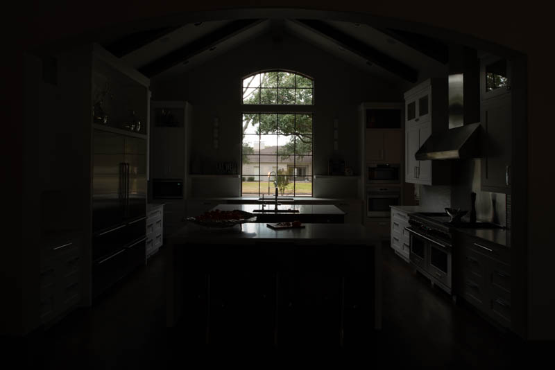
Managing mixed lighting in an architectural photo is a job for the image editor. It is a challenge that I face in almost every image that I work with. Over the years, I have developed a number of special processing techniques that allow me to control the color to an extent that other photographers, even professionals do not always achieve. Bragging? Yeah, but color really is my forte. :-) There are a number of ways to deal with mixed lighting, but the the way that usually works best for me involves a shooting technique that I teach to the photographers that I collaborate with. It's designed to make it possible for me to more precisely control the color in the final edited photograph. All you need to do is shoot with all the lights on, and then shoot again with all the lights off. It's that simple. You can easily do it on all of your interior photos.
THIS SORT OF COMPOSITE RENDERING IS AT THE HEART OF MY "SUPER DOUBLE SECRET SHOOTING TECHNIQUE." Check it out here if you think you're ready :-)WANT TO KNOW MORE? LET'S TALK.Talk is free and I love chatting with designers and photographers. Operators are NOT standing by. It's just me. :-) |
About Me
How Does It Work?
Shoot with your iPhone?
INFO FOR THE SHOOTERManaging the Perspective
Managing Mixed Lighting
My Shooting Technique
|

 (there's usually a little icon), or you can set it for the indoor lighting
  (often referred to as Incandescent or Tungsten). Luckily, it doesn't have to be that complicated because you can also choose an "Auto" setting, which I normally recommend for all of your exposures.
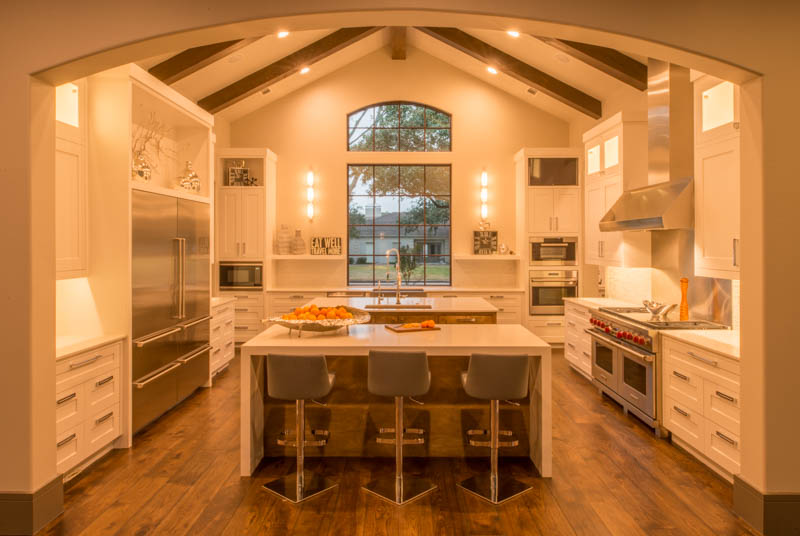
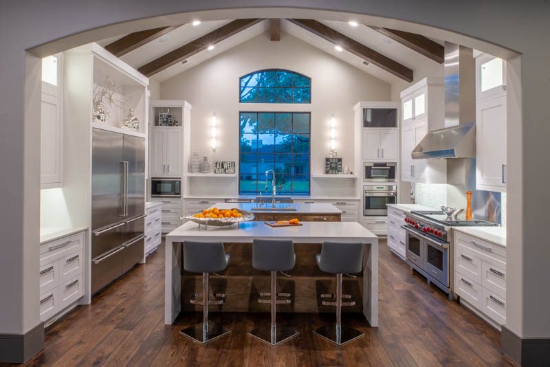
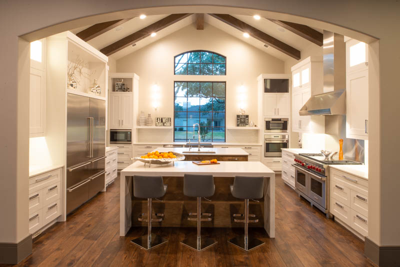
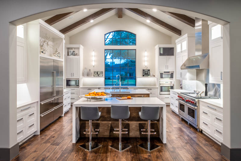
 This beautiful kitchen features a predominantly neutral color scheme. The designer chose the palette, and it simply must come across in the photograph. The cabinets are white. Not off-white. Not tan. Not orange. But correcting the color of the interior results in a ghastly blue color from the windows which would have stuck out like a sore thumb (see above) if it had not ALSO been corrected.
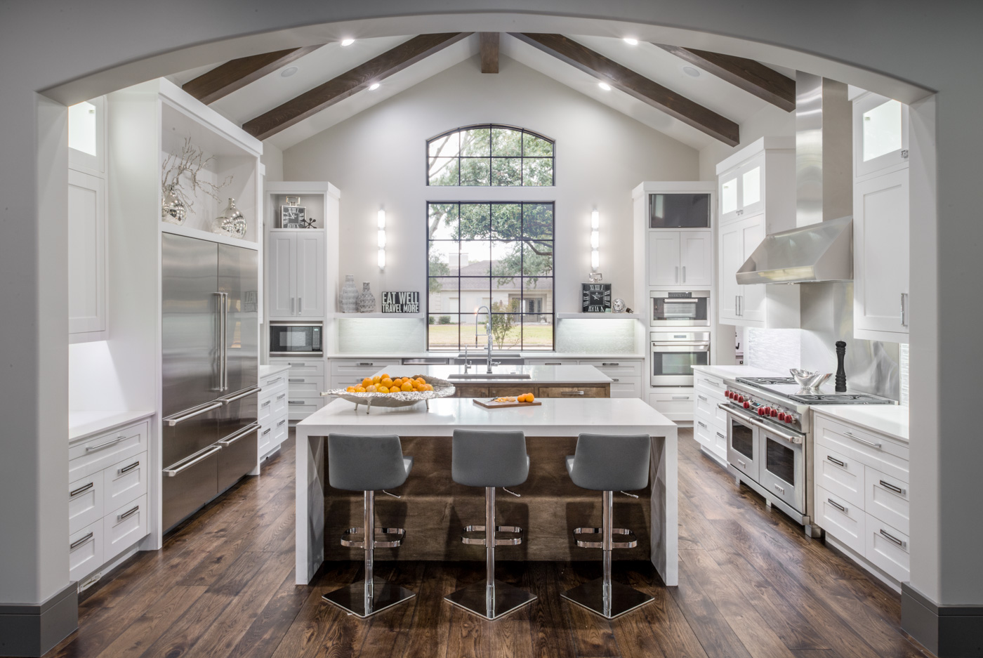